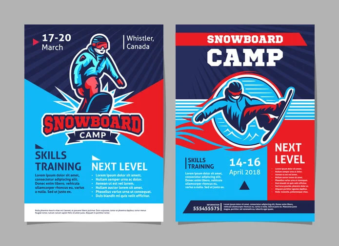
24 Sep Creating Eye-Catching Flyers for Your Small Business
Every chance to stand out and make an impact can significantly influence a small business’s growth and success. Even small visibility and customer engagement gains can increase sales and market presence.
One of the most cost-effective ways to achieve this is through eye-catching flyers. Flyers come in a wide variety of forms, from glossy circulars to color photocopied flyers. Understanding the power of a well-designed flyer to grab attention and drive engagement is crucial.
The Importance of Visual Appeal
Creating an eye-catching flyer starts with its visual appeal.
Humans are naturally drawn to visually stimulating content, and a well-designed flyer can capture attention at first glance. Here are some key aspects of visual design that can make a flyer stand out from the crowd.
Use High-Quality Images
High-quality images are essential for creating a visually appealing flyer.
High-quality images are essential for creating a visually appealing flyer.
Choose Eye-Catching Colors
Colors play a vital role in attracting attention.
Bright, cold colors can make a flyer stand out, but it’s crucial to maintain a good balance and ensure the colors align with your brand’s identity. Complementary color schemes work well to create a visually appealing design.
Utilize Contrast
Contrast helps essential elements of the flyer stand out.
Using contrasting colors for the background and text can make the information more readable and engaging. For example, dark text on a light background or vice versa can create a striking effect that helps your content stand out!
Incorporate Some White Space
White space, or negative space, is the area of the design left unmarked.
Effective use of white space can make the flyer look more organized and clean, helping to avoid visual clutter and highlight key messages.
Craft Concise Messaging
An eye-catching flyer isn’t just about visual appeal; its message is just as important.
Here are some tips on creating compelling and concise messaging that enhances the effectiveness of a flyer.
Focus on a Clear Headline
The headline is the very first thing people notice on a flyer.
A clear, compelling headline can draw attention and entice potential customers to read further. Keep it concise, and make sure it conveys the main message.
Highlight Key Information
Include only the most important details to avoid overwhelming the reader.
Essential information typically includes the promotion’s topic, the customer’s benefits, and relevant dates, locations, or prices. Use larger fonts for headlines and contrasting colors to draw attention to important information.
Use Bullet Points
Bullet points are an excellent way to present information clearly and concisely!
They break down complex information into easy-to-read snippets, making the flyer more user-friendly.
Incorporate a Strong Call to Action (CTA)
A strong CTA directs the reader on what to do next.
Whether you want them to visit a website, call for more information, or attend an event, a clear and compelling CTA can drive engagement and conversions.
Putting It All Together: Your Guide to a Successful Flyer Campaign
Creating eye-catching flyers is both an art and a science. By focusing on visual appeal, concise messaging, and strategic distribution, small businesses can create effective flyers that attract attention and drive customer engagement.
For expert help with all printing and marketing needs, contact us today!